WASH+
OVERVIEW
Car enthusiasts invest thousands into their vehicles yet often find it challenging to book trustworthy and professional detailing services that meet their expectations.
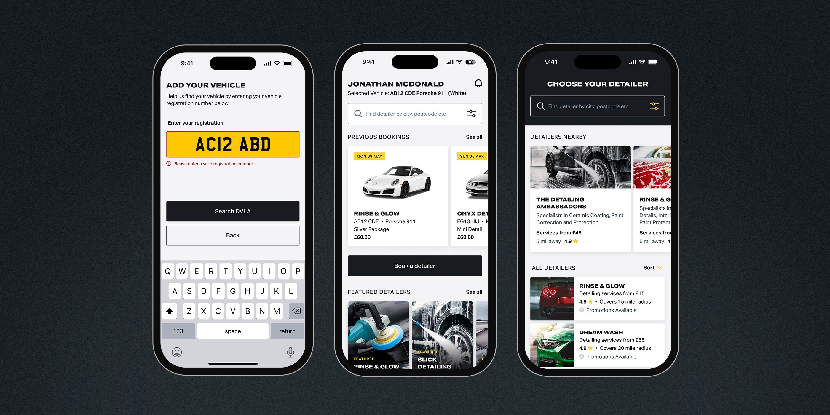
I designed a mobile app connecting car enthusiasts with professional detailers, helping them to easily compare and book comprehensive detailing services at a convenient time and place.
My Role:
Visual Identity, UX Design
Project Type:
Visual Identity and App Design
Deliverables:
User Research
Visual Identity
Visual Design
Wireframing
Prototyping
Usability Testing
A detailing app connecting car enthusiasts with professional detailers.
What issues do car enthusiasts face when maintaining their vehicles?
Insights from testing top-rated detailing apps on the App Store:
Payment issues
Information overload
Confusing navigation (non-clickable elements appearing as buttons)
Unattractive UI design (poor contrast, hierarchy, etc.)
Image: Screenshots of popular car detailing / car wash apps from the App Store.
Building a Visual Identity That Connects with My Target Audience
Researched and gathered inspiration to inform the design direction
Created a versatile name that appeals to all vehicle makes and models
Sketched concepts and explored color palettes and graphic styles
Focused on developing a visual identity that truly resonates with my audience
Image: A moodboard of visual elements exploring the identity for the app's branding and visual design.
Designing the key user flow:
signing up and booking a detailer
Image: A user flow indicating the process of signing up to the app and booking a detailer.
Mapped out the user flow with mid-fidelity wireframes in Figma
I chose mid-fidelity wireframes to clearly define the user flow and interactions, providing a better sense of structure than sketches.
They allowed for more accurate usability testing, helping to spot potential issues early in the process.
Mid-fidelity wireframes struck the right balance between detail and flexibility, enabling quick iterations while still refining the design.
Image: Wireframes showing some of the main screens of the user flow.
Image: Wireframes showing the complete user flow of booking a detailer.
With the mid-fidelity prototype ready, user testing was underway and revealed the following:
Button placement needed improving
Removing breadcrumbs as it was unnecessary
Utilising important data like reviews to help users confirm choices quicker
Image (left): Annotated wireframes critiquing the design.
Image (right): Testing the Figma prototype on a mobile device.
Utilising User Feedback to Create Hi-Fidelity Wireframes
Analysed user feedback to identify pain points and prioritise improvements
Refined layout, interactions, and task flow for better usability and accessibility
Incorporated visual elements to align with the brand and enhance user experience
Iterated designs to validate changes and ensure the final product met user needs
Image: Hi-fidelity wireframes of the final app design for Wash+.
Final learnings
Positive feedback from final testing, but opportunities for improvement
Strengths:
The visual design and overall functionality of the app were well-received.
Areas for Improvement:
Enhancing the process for pausing and returning to reservations to improve user flow.
Adopt a proactive approach to problem solving
Utilising resources like YouTube to learn best practices in building complex components significantly improved my workflow, leading to more organised and efficient designs.
Take time to explore the details and avoid rushing
Key takeaway: Allocating more time to thoroughly explore user flows and dive into details helps prevent oversights and ensures a more refined end product.


